
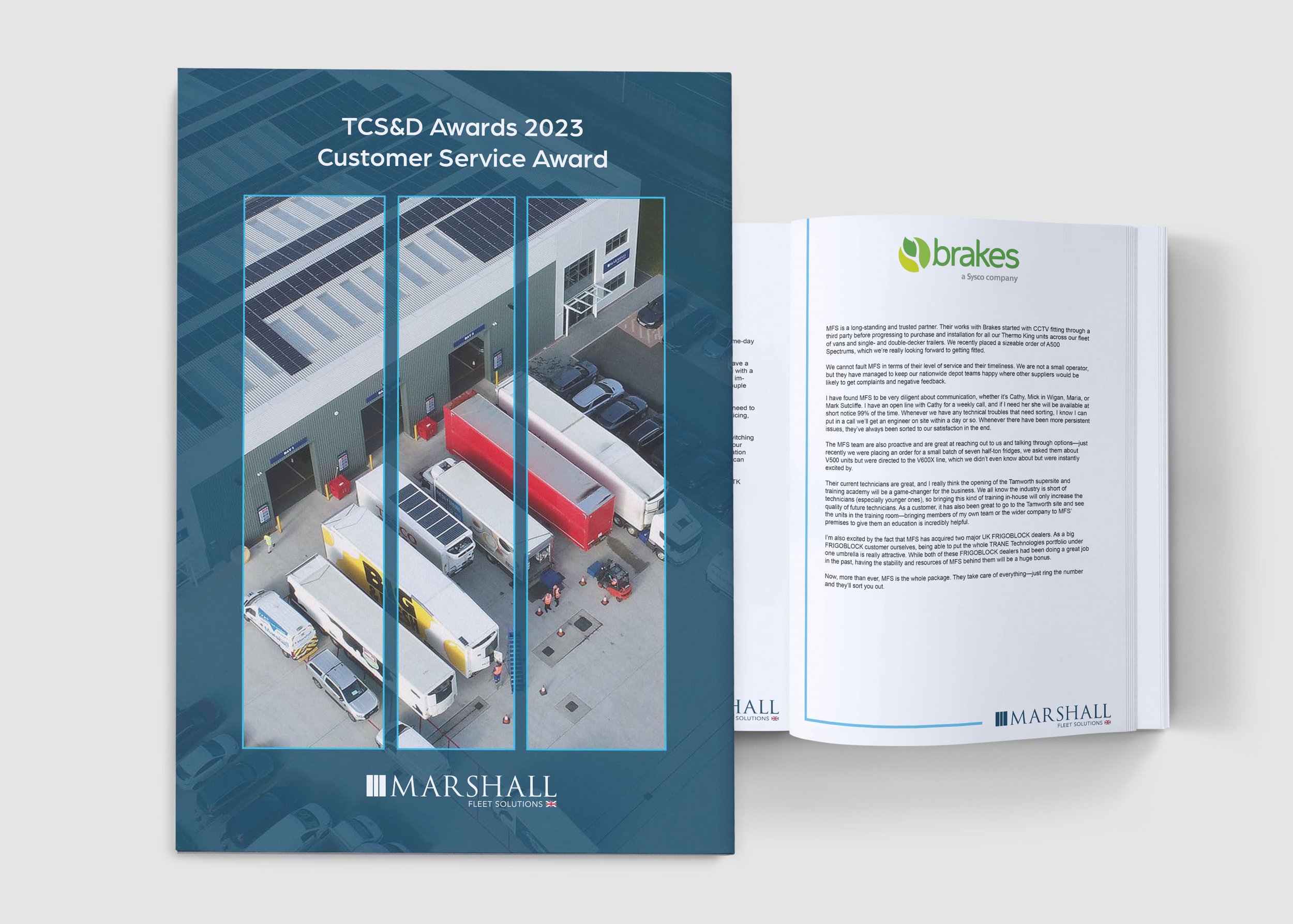
And the award goes to…
Award entries are such a great opportunity to really sharpen up a company image and trial stylised versions of the brand and image treatments. These types of briefs are always interesting in terms of finding methods to represent key selling points and data. The direction I took for the entries developed into a template which was image focused and simplified. The brand presentation was simple and impactful, it sat beautifully with the public facing branding style.


The direction of the brochures was interesting as we developed them throughout rebranding. The simplified whitespace style was the result of the style becoming more simplistic and image based. The older styles represent the growing use of icons and imagery, you will also recognise the start of reduced copy and increased white space. The two styles ran parallel prior to the rebrand.
Brochures where less is always more


